What wall color goes with everything?
Understanding the Basics of Neutral Colors
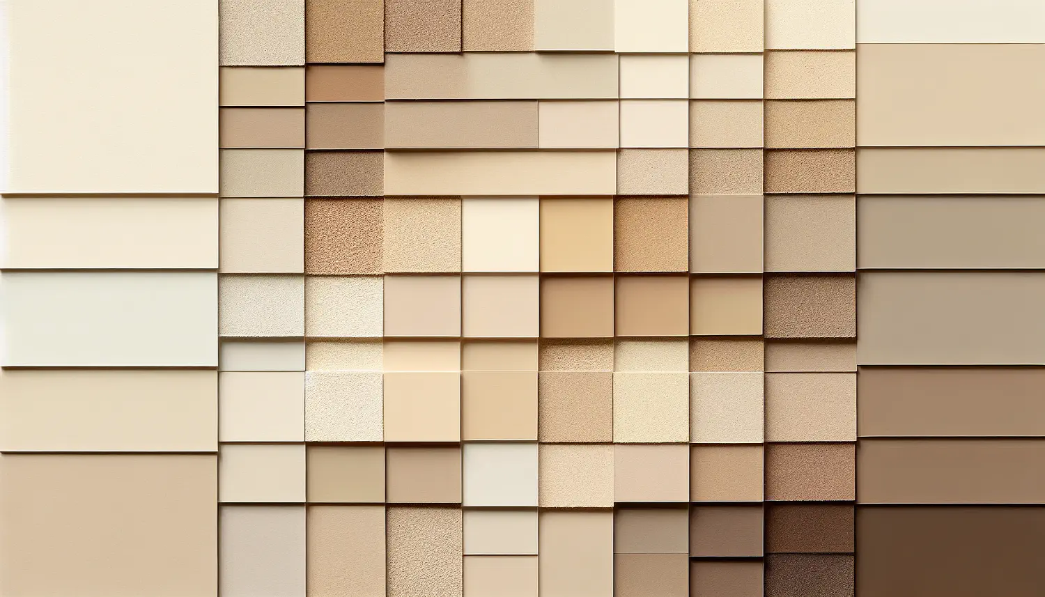
The Role of Neutral Tones in Interior Design
Neutral tones act as the cornerstone of interior design, offering a backdrop that weaves a thread of continuity and calm throughout your home. Think of neutrals as a canvas—a space where personality, textures, and accent colors come alive. At Scottsdale House Painters, we pride ourselves on helping you select the subtle yet impactful shades that make your spaces sing with harmony. For an insider look, check out this video for neutral color inspiration in your sacred spaces.
Common Neutral Color Schemes
The beauty of neutrals lies in their versatility. Here are a few common palettes we adore:
- Monochromatic: varying shades of the same color
- Analogous: colors next to each other on the color wheel
- Complementary: colors opposite each other on the color wheel
By blending these schemes, you create dimension and warmth. Dive deeper into designing with neutrals through this resourceful video.
The Most Versatile Wall Colors to Consider
Classic White and its Variants
White is not just white. It’s a spectrum. There’s creamy ivory for warmth, crisp alabaster for a sharp, modern feel, and so much more. Each tone brings a distinct ambiance. At Scottsdale House Painters, we’ll help you find your perfect variant.
Shades of Gray: From Light to Charcoal
Gray paints are not all gloom. They range from ethereal pale mists to bold charcoals. Grays can be cool and elegant or warm and enveloping.
Accentuating with Universal Colors
Incorporating Black as an Accent
Black is the ultimate accent—daring yet grounded. It gives depth and sophistication when used in trim work, doors, or even an accent wall.
Black accents in design are like a punctuation mark in writing—a tool that commands attention.
Utilizing Navy Blue and Deep Greens
Similarly, navy blue and deep greens can serve as near neutrals. They pair wonderfully with lighter tones to create a balanced but dynamic decor.
The Elegance of Burgundy and Earthy Tones
Burgundy and earthy tones bring in the warmth of nature. Combine them with neutral backgrounds for a rich, luxurious aesthetic.
Complementary Colors for Furniture and Decor
Matching Colors with Wood Tones
Wood tones can dictate your neutral palette. Lighter woods work well with cooler neutrals, while darker woods demand warmer hues.
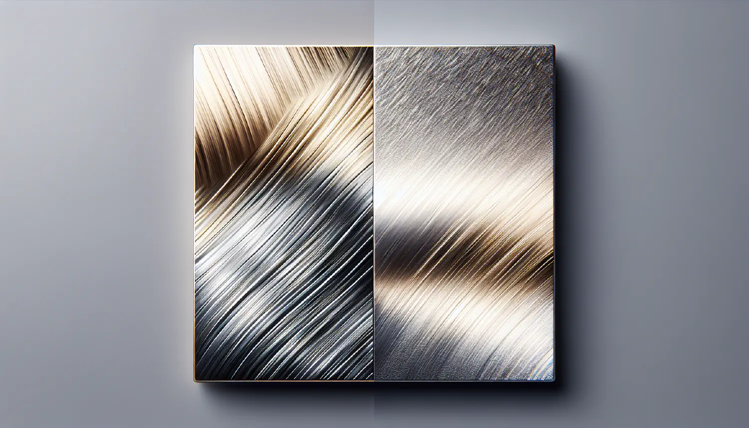
Coordinating with Metal Finishes
Metals add sheen and texture. Brushed nickel and chromes are superb with cool tones, while copper and gold enhance warm neutrals.
The texture of your fabrics—from linen to velvet—will affect how the color appears. It must complement the neutral tones of your walls.
Lighting and Wall Color Dynamics
The Impact of Natural Light on Color
Natural light can alter your perception of color at different times of the day. When selecting paint, observe how samples change from dawn to dusk.
Selecting Color Based on Room Orientation
North-facing rooms need warmer tones to balance the cool light, while south-facing rooms can handle cooler neutrals that bask in the abundance of light.
Maintenance and Longevity of Neutral Paints
Easy-to-Clean Paint Finishes
Our clients love satin and eggshell finishes. These are resilient and perfect for rooms that must endure the test of daily life.
Neutral Colors that Hide Wear and Tear
Some neutrals mask scuffs and smudges better than others. Taupe and light grays are enduring choices that maintain a clean look longer.
Current Trends in Neutral Wall Colors
Popular Neutral Color Palettes of 2023
Greige—the blend of gray and beige—is on-trend right now. It offers the perfect balance between warmth and modernity.
How Bold Neutrals are Changing the Game
Beiges with pinkish undertones and mocha-inspired hues give a contemporary twist to traditional neutrals. They’re bold without overpowering.
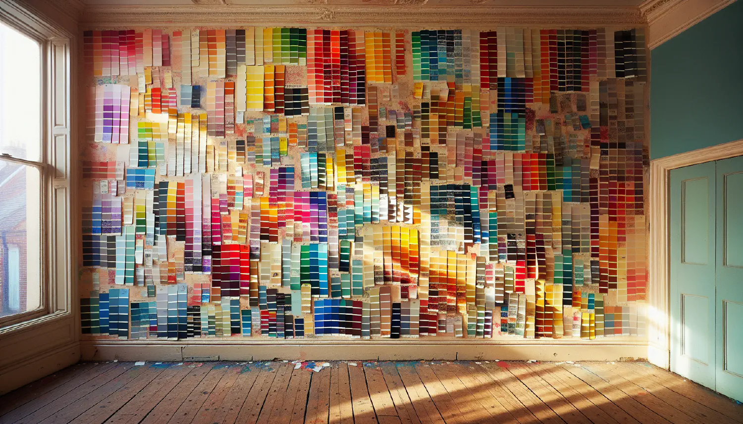
Tips for Choosing the Right Paint Color
Sampling Paint Swatches in Different Lighting
Don’t skip this essential step. Tape swatches to your walls and watch how they transform. It’s the key to selecting with confidence.
Maintain coherence by considering how each room connects. Here’s a handy guide:
- Identify the most visible areas.
- Choose a consistent color for those spaces.
- Introduce subtle variations to differentiate rooms.
Remember, at Scottsdale House Painters, our brush is poised to introduce the neutral hues that will elevate your living space to a masterpiece of comfort and style.